WORDPRESS
Tarjeta hexagonal efecto elementor free (truco, Tips and Tricks) wordpress 126 tutorial español
En este tutorial de SYSPA SOCIAL veremos como crear una tarjeta hexagonal con efecto de movimiento y sobre debajo de las mismas, utilizando elementor free en wordpress.
Un impresionante efecto que con este tutorial será muy simple de lograr, por lo cual solo tienes que ver los pasos y seguirlos para hacer tu pagina web cada vez mas profesional.
Sin utilizar ningún plugin adicional podrás crear un efecto de movimiento, sombra y animación increíble.
Principales puntos del tutorial efecto tarjeta hexagonal en wordpress.
- Creamos la base de nuestra primer tarjeta
- Incluirnos contenido a nuestra tarjeta
- Definimos la forma hexagonal
- Creamos efecto de sombra con movimiento.
- Creamos efecto de transparencia al pasar el cursor.
- Probamos todo lo realizado.
Código Utilizado
Hexagono
<style>
/*Hexagon Clip-Path*/
.hexagono{
clip-path: polygon(0 25%, 50% 0, 100% 25%, 99% 75%, 50% 100%, 0 75%);
-webkit-transition: all 0.5s !important;
transition: all 0.5s !important;
}
</style>
Gradiente Efecto
/*Gradient Overlay Show/Hide CSS*/
.hexagono .elementor-background-overlay{
-webkit-transition: all 0.5s !important;
transition: all 0.5s !important;
opacity: 0 !important;
}
.hexagono:hover .elementor-background-overlay{
opacity: 0.85 !important;
}
/*Column Element Show/Hide CSS*/
.hexagono .elementor-column{
opacity: 0;
-webkit-transition: all 0.8s !important;
transition: all 0.8s !important;
}
.hexagono:hover .elementor-column{
opacity: 1;
}
Sombra
/*Shadow transition Effect CSS*/
.hexagono:hover{
-webkit-transform: translateY(-30px);
transform: translateY(-30px);
}
.hexasombra::before{
content: '';
position: absolute;
bottom: -70px !important;
width: 100%;
color: #fff;
height: 60px;
border-radius: 50%;
background: -webkit-radial-gradient(rgba(0,0,0,0.15),transparent, transparent);
background: radial-gradient(rgba(0,0,0,0.15),transparent, transparent);
display: block;
-webkit-transition: all 0.8s !important;
transition: all 0.8s !important;
z-index: 999;
}
.hexasombra:hover::before{
opacity: 1 !important;
-webkit-transform: scale(0.8);
transform: scale(0.8);
}
Si usas elementor PRO, utiliza este codigo diretamente en el CSS de cada objeto.
Código Utilizado
Hexagono
/*Hexagono Copiar en Seccion Interior*/
selector{
clip-path: polygon(0 25%, 50% 0, 100% 25%, 99% 75%, 50% 100%, 0 75%);
-webkit-transition: all 0.5s !important;
transition: all 0.5s !important;
}
Gradiente Efecto
/*Gradiente Superposicion Pegar en Seccion Interior*/
selector .elementor-background-overlay{
-webkit-transition: all 0.5s !important;
transition: all 0.5s !important;
opacity: 0 !important;
}
selector:hover .elementor-background-overlay{
opacity: 0.85 !important;
}
/*Column Element Show/Hide CSS*/
selector .elementor-column{
opacity: 0;
-webkit-transition: all 0.8s !important;
transition: all 0.8s !important;
}
selector:hover .elementor-column{
opacity: 1;
}
Sombra
/* Efecto Sombre Pegar en Columna Exterior*/
selector:hover{
-webkit-transform: translateY(-30px);
transform: translateY(-30px);
}
.hexasombra::before{
content: '';
position: absolute;
bottom: -70px !important;
width: 100%;
color: #fff;
height: 60px;
border-radius: 50%;
background: -webkit-radial-gradient(rgba(0,0,0,0.15),transparent, transparent);
background: radial-gradient(rgba(0,0,0,0.15),transparent, transparent);
display: block;
-webkit-transition: all 0.8s !important;
transition: all 0.8s !important;
z-index: 999;
}
.hexasombra:hover::before{
opacity: 1 !important;
-webkit-transform: scale(0.8);
transform: scale(0.8);
}
Videos relacionados con efecto tarjeta hexagonal con elementor.
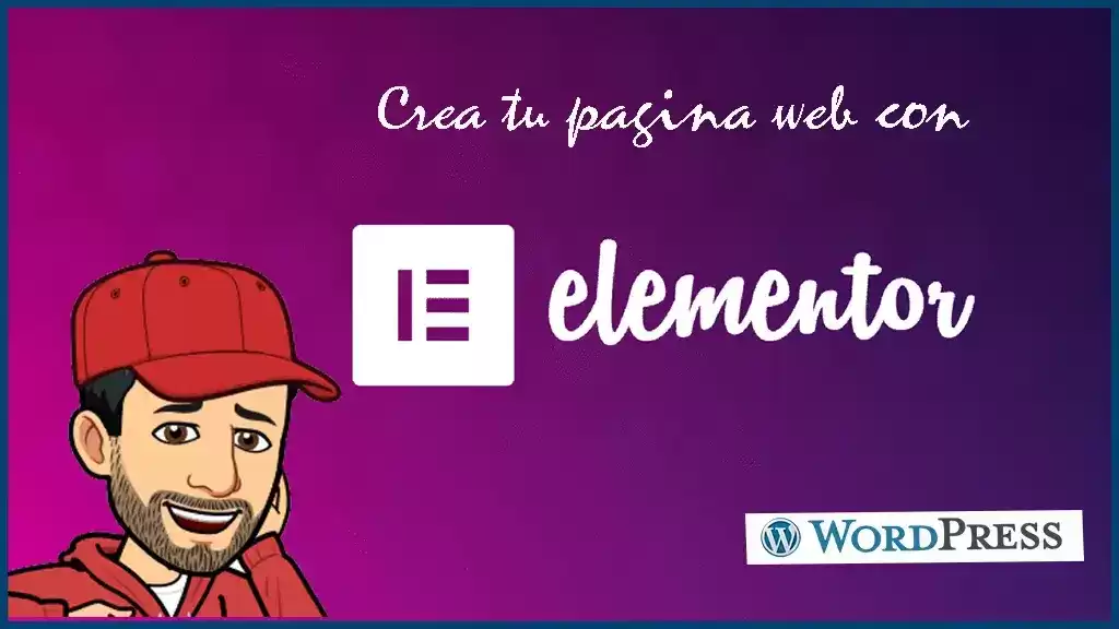
🖐️ Como hacer tu pagina web con elementor, WordPress 48, tutorial o curso español.
Agregaremos un chat de whatsapp a tu pagina web wordpress de manera simple y gratis.
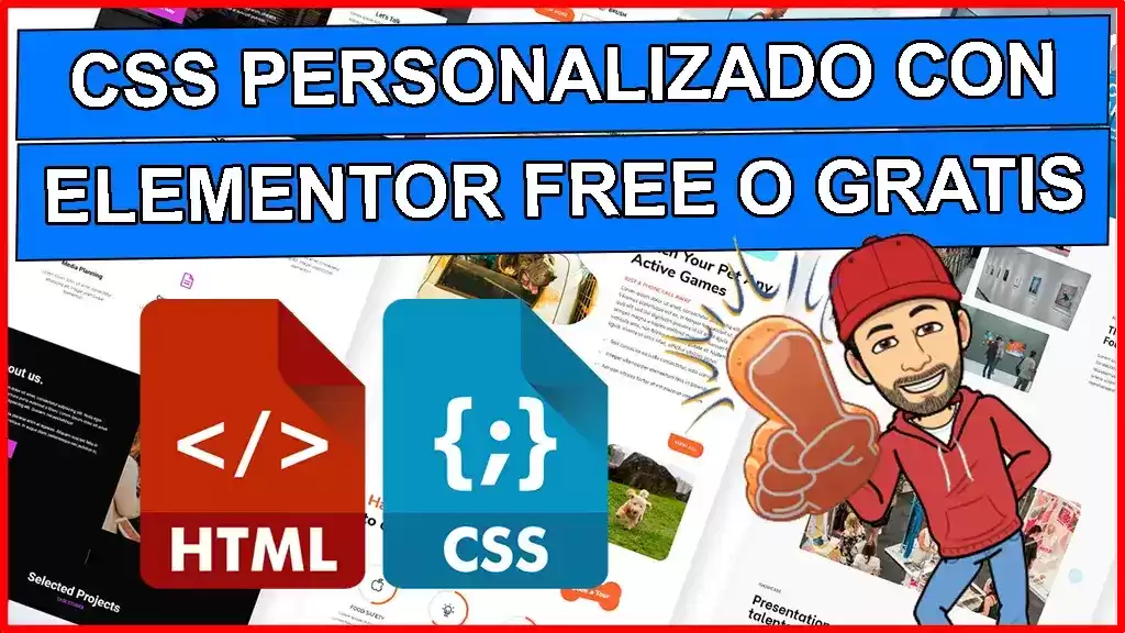
🖐️ como usar CSS personalizado con elementor free o gratis, wordpress 49 tutorial o curso español.
Aprenderemos como podemos utilizar CSS personalizado para toda la pagina wordpress, una clase o un objeto en particular, utilizando elementor free o gratis
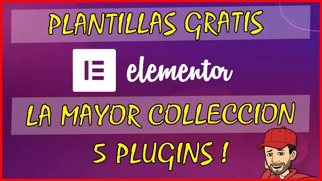
🖐️ Plantillas gratis para elementor, la mayor colleccion, 5 plugins, wordpress 91, tutorial español.
Veremos la mayor colección de plantillas graits para elementor de calidad. Todo en 5 plugins inperdibles!..
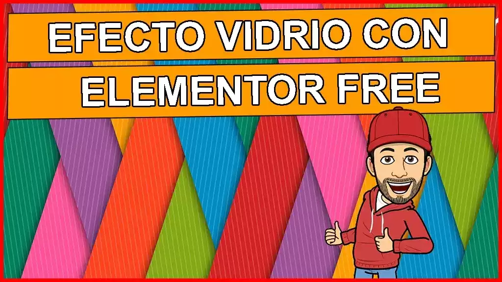
🖐️ Efecto vidrio en elementor (glass effect), wordpress 122 tutorial o curso español.
Veremos como crear el efecto vidrio en elementor, para que puedas crear tarjetas en tu pagina web wordpress.

Tenemos Cientos de tutoriales Wordrpess
Inicia aquí gratis !
Accede al listado completo de tutoriales wordpress.